
Detailed Garment, Simpler Accessories: A Practical Checklist
If you are comparing a detailed garment with simpler accessories, this checklist helps you separate visible detail, colour, proportion, texture, line, and context before you choose. It is for readers who want a practical, body-neutral way to compare options without turning style into a fixed rule.
Key points
- Start by describing only the visible garment detail before comparing accessories.
- Check colour, line, texture, and scale separately instead of relying on a vague sense of “simple” or “busy.”
- Use neutrals and prints as flexible options, not fixed rules.
- Let proportion, context, and personal preference guide the final decision.
- A simpler accessory is one option, not a universal requirement.
What this checklist can and cannot decide
A detailed garment simpler accessories checklist is useful when you want to compare two or more styling options in a calm, structured way. It helps compare the visual weight of what is present: colour, pattern, texture, line, scale, and the role each accessory plays. It makes no ownership or preference assumption and does not identify one option as automatically best in every situation.
That matters because colour coordination is flexible, not fixed. Fashion combinations change over time, and choices that once felt unusual can later feel accepted. Neutral colours can also work as a flexible base, especially when a print is involved. Proportion matters too: the same colours can read differently depending on how they are distributed. Personal preference and context should still have the final word.
If you want a simple rule, this checklist is not built to give one. It is built to help you compare visible factors before you decide.
Check 1: describe only the garment detail you can see
Start with observation, not assumptions. Write down only the garment details that are visible in the item you are comparing. This keeps the process grounded in the actual piece rather than in guesses about the person, the occasion, or the intended effect.
A useful description can stay very plain:
- Is there visible print, surface detail, or texture?
- Does the garment read as visually active or relatively calm?
- Is the detail concentrated in one area or spread more evenly?
- Which colour family is visible at a glance?
This step is not about judging the garment. It is about naming what is there so the accessory comparison can stay specific.
Check 2: identify each accessory’s visual role
Before comparing accessories, separate their visual role into smaller parts. A styling checklist works better when you look at colour, line, texture, and scale individually instead of using only broad labels like “simple” or “busy.”
A practical way to review each accessory is to ask:
- What colour is it, and how does that colour relate to the garment?
- Does it add a straight line, a curved line, or another visible shape?
- Is the texture smooth, reflective, matte, woven, or otherwise noticeable?
- Does it read as small, medium, or large relative to the garment detail?
This is especially useful because clothing, accessories, hair, and makeup are separate styling areas. Looking at them separately makes the decision more repeatable and less vague.
Check 3: compare colour without imposing a palette
Colour does not need a fixed formula. Fashion colour coordination is flexible, and accepted combinations can change. That means the checklist should compare colour relationships rather than force a single answer.
A good comparison usually starts with three questions:
- Is the accessory close to the garment’s colour family?
- Is it neutral?
- Is it clearly contrasting?
Neutrals can be especially flexible because they pair well with other colours and with prints. That makes them useful as a comparison point, but not a universal solution. A print and a neutral can work together, and a colour-to-colour combination can also work when the overall relationship feels coherent.
The point is not to decide in advance that simpler accessories are always better. The point is to see what the colour relationship actually does in the specific comparison.
Check 4: review line, texture, and scale separately
Once colour is clear, look at the other visual qualities on their own.
Line
Line refers to the visible direction or shape an accessory brings into the look. Some accessories add a clean line, while others create a softer or more elaborate one. Line matters because it changes how the eye moves across the outfit.
Texture
Texture is the surface feel the eye can read: smooth, matte, shiny, woven, detailed, or more pronounced. A textured accessory does not automatically conflict with a detailed garment, but the combination should still be checked rather than assumed.
Scale
Scale is the size relationship between the garment detail and the accessory. Proportion matters here. The same colours can look different depending on how they are distributed, so a small accessory can still have a strong visual effect if it is placed where the eye notices it easily.
This step keeps the visible comparison separate from a vague reaction such as “this seems too much.” You can ask instead: is the line consistent, is the texture competing, and is the scale balanced in this specific comparison?
Check 5: use the supplied context and personal preference
After the visual review, bring in context and preference. These are not afterthoughts; they are part of the final decision.
Context can include the lifestyle or cultural setting around the styling choice. Personal styling is not only about one visual formula. It can also adapt choices for different occasions and settings, and it can separate wardrobe, makeup, hair, and related appearance decisions as distinct areas.
A simple final filter is:
- Does this combination fit the supplied context?
- Does it feel comfortable and appealing to the person making the choice?
- Does it still make sense after reviewing colour, proportion, line, texture, and scale?
If the answer to the first two questions is yes, the choice may be stronger even if it is not the most minimal one.
Editorial examples with no preferred answer
The following are hypothetical comparisons only. They are not rules and they do not assume any specific wardrobe, body, budget, or occasion.
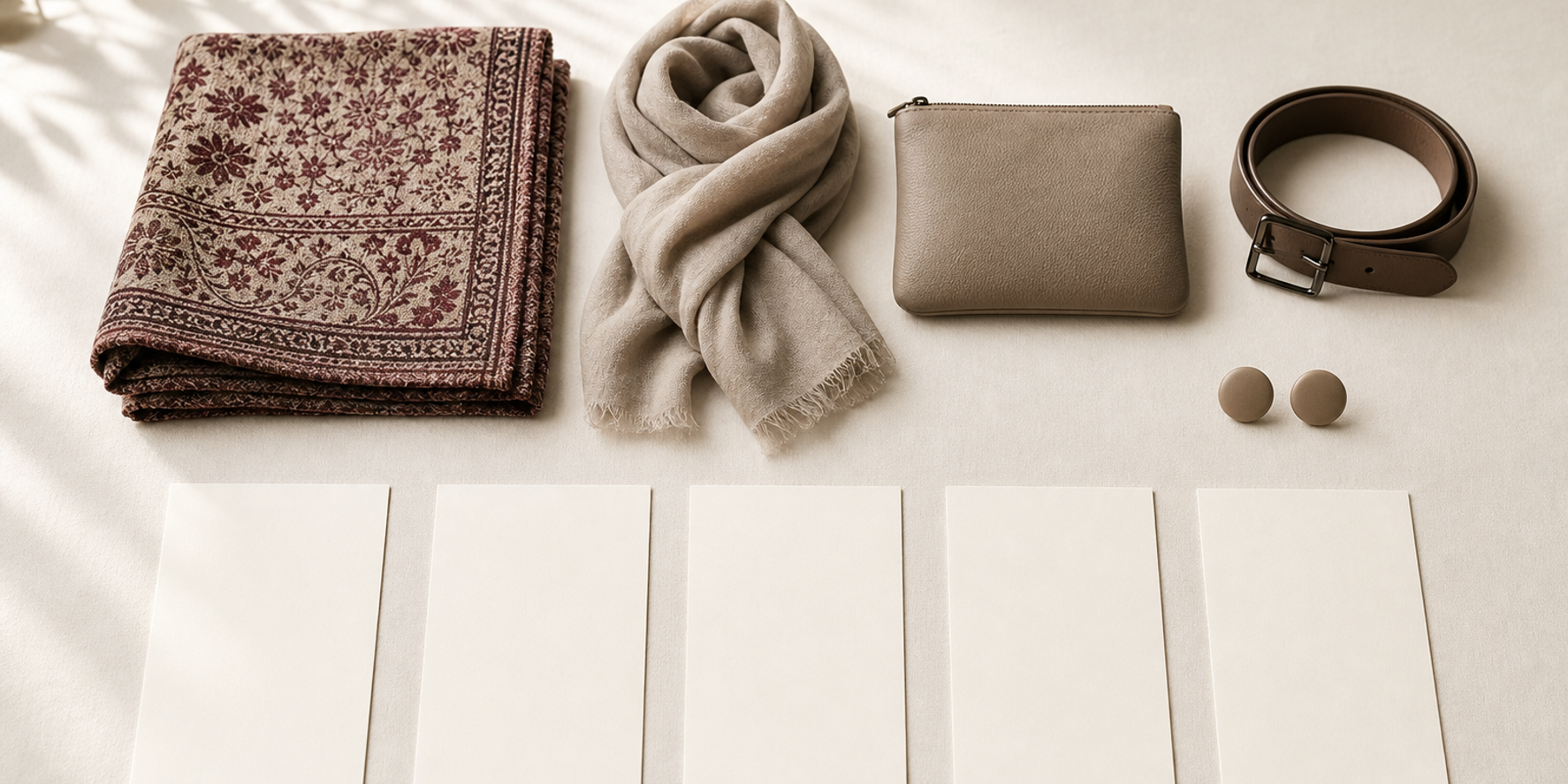
Editorial example: A garment with visible print or surface detail is compared against a neutral accessory to test whether the accessory supports the garment without competing with it.
In this example, the neutral option is not automatically the right answer. It is simply one option to test against the garment’s visible detail.
Editorial example: A highly textured accessory is compared against a more straightforward garment surface to check whether the combined look feels balanced in proportion and colour.
Here, the checklist asks whether the accessory’s texture changes the visual balance in a useful way, rather than assuming texture must be reduced.
Editorial example: Two accessory options are tested side by side: one in a neutral colour and one in a contrasting colour, then reviewed for line, texture, and scale separately before choosing.
This comparison is useful when the colour question is not enough on its own.
Editorial example: A detailed garment is paired with a solid accessory in the same colour family, then with a different colour family, to see how proportion changes the overall result.
This shows why proportion matters: the same general colour idea can look different once it is distributed differently across the outfit.
A printable-style final checklist
Use this as a reusable yes/no or maybe format before making the final choice.
Garment details
- What is visibly detailed on the garment?
- Is the garment’s detail concentrated or spread out?
- Does the garment read as visually active?
Accessory comparison
- What colour is the accessory?
- Is it neutral, similar, or contrasting?
- What line does it add?
- What texture does it add?
- What scale does it add?
Relationship check
- Does the accessory support the garment’s visible detail?
- Does it compete with the garment in a way that feels intentional or unnecessary?
- Does the proportion feel coherent in this specific comparison?
Final filters
- Does the supplied context support this choice?
- Does the choice align with personal preference?
- Does the result feel comfortable and appealing to the person making the decision?
If the answer is mixed, you do not need a universal rule. You only need to return to the visible details and compare again.
When a simpler accessory is not the intended choice
A simpler accessory can be a useful comparison point, but it is not a universal requirement. The approved sources support flexible colour coordination, neutrals, proportion, and context. They do not support the idea that the simplest option is always the best option.
That means a more visually active accessory can still be a reasonable choice if the colour relationship works, the proportion is coherent, and the supplied context or personal preference points in that direction.
This is where the checklist helps most: it slows the decision down enough to distinguish between “simple,” “balanced,” and “appropriate for this specific comparison.” Those are not the same thing.
Quick summary
If you want a practical way to compare a detailed garment with simpler accessories, start with what is visible, then separate colour, line, texture, and scale. Check proportion carefully. Use neutrals and prints as flexible options rather than fixed rules. Finish by letting context and personal preference decide the final direction.
Frequently asked questions
Is there a fixed rule for whether simple accessories are better?
No. The approved sources support flexible colour coordination, neutral options, proportion, and context. They do not support a universal rule that simpler accessories are always the best choice.
Can neutrals work with print?
Yes. Neutral colours can act as a flexible foundation, and the sources note that neutrals pair well with prints.
Why does proportion matter so much?
Because the same colours can look different depending on how they are distributed. Proportion changes the result even when the colours themselves stay the same.
Should I decide based on colour alone?
Not if you want a fuller comparison. Colour is important, but line, texture, scale, context, and personal preference also belong in the decision.
What if the supplied context and my preference do not match the most minimal option?
Then use them as final filters. The checklist is meant to support a context-sensitive choice, not to force a single styling rule.
Related guides
Questions readers often ask
Is there a fixed rule for whether simple accessories are better?
No. The approved sources support flexible colour coordination, neutral options, proportion, and context. They do not support a universal rule that simpler accessories are always the best choice.
Can neutrals work with print?
Yes. Neutral colours can act as a flexible foundation, and the sources note that neutrals pair well with prints.
Why does proportion matter so much?
Because the same colours can look different depending on how they are distributed. Proportion changes the result even when the colours themselves stay the same.
Should I decide based on colour alone?
Not if you want a fuller comparison. Colour is important, but line, texture, scale, context, and personal preference also belong in the decision.
What if the supplied context and my preference do not match the most minimal option?
Then use them as final filters. The checklist is meant to support a context-sensitive choice, not to force a single styling rule.
Continue with a calm next step
If you want to keep comparing style choices in a structured way, you can browse the Smart Wardrobe knowledge page.
Open Smart Wardrobe resources