
How to Balance a Detailed Garment with Simpler Accessories
If you want to balance a detailed garment with simpler accessories, start with the garment’s visible detail, then compare colour, proportion, and personal taste. This guide is for anyone who wants a body-neutral, context-based way to compare options without treating one styling choice as a universal rule.
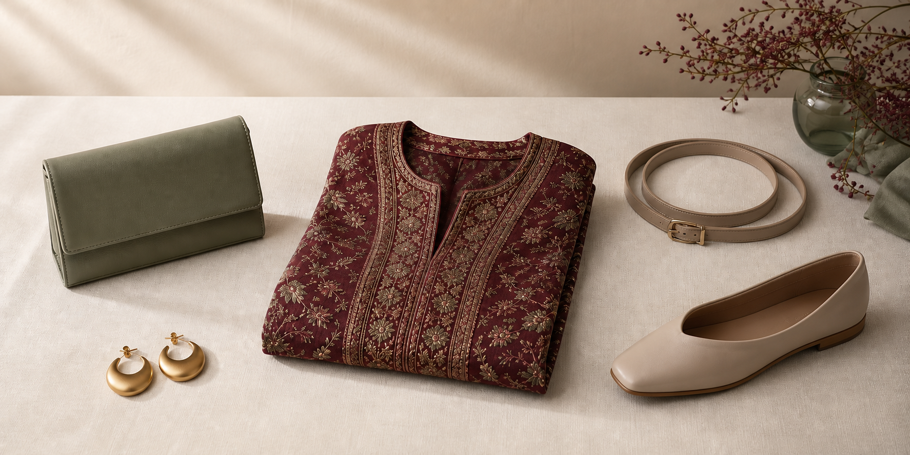
Key points
- Color coordination is flexible, not a fixed universal rule.
- Neutral colours can be used as adaptable comparison tools.
- Warm and cool colour groupings can help as a starting point, but they are optional.
- Proportion can change how a coordination choice reads.
- Personal preference and supplied context should have the final say.
What this decision guide can and cannot decide
If you want to balance a detailed garment with simpler accessories, the most useful starting point is not a fixed styling rule. It is a comparison process. The approved sources support color coordination as a flexible decision, describe neutrals as adaptable, and leave room for personal taste and changing trends. That means the right answer depends on the garment’s visible detail, the accessory’s role, and the context you were given.
This guide is for readers who want a practical way to compare options without assuming a body type, wardrobe, occasion, or preference. It will help you identify what is visually active, test whether an accessory supports or competes with that detail, and keep personal preference in the final decision.
For a related colour-focused overview, see How to Combine Colors in an Outfit Without It Feeling Busy.
Step 1: name the garment’s visible detail
Start by describing the garment in plain language. Is the standout feature a print, embellishment, contrast, surface pattern, or another visible detail? This matters because the comparison becomes clearer once the main feature is named. You do not need to decide yet whether the accessory should be simpler, louder, or more neutral.
A useful question is: what is the garment asking the eye to notice first? If the garment already has a strong detail, the accessory can be tested as something that supports, repeats, or competes with that detail.
Step 2: identify the visual role of the accessory
Instead of asking whether an accessory is “right,” ask what it does visually.
- Does it support the garment’s main detail?
- Does it repeat a color or surface already present?
- Does it create a second focal point?
That comparison is more useful than trying to force a universal answer. The same colours in different proportions can create different results, so the accessory’s role depends partly on how much visual space it takes up.
Step 3: compare colour without turning it into a rule
The approved sources treat colour as something you can use deliberately, not as a fixed formula. Neutrals are described as flexible coordination tools, so they can be a helpful baseline when you are comparing alternatives. Black, white, and gray can function as a foundation for many combinations.
Warm and cool groupings can also work as a starting point if that makes the comparison easier. For some readers, it is useful to test whether the garment and accessory sit in the same general temperature family before moving on. For others, that framework may be less helpful than direct side-by-side comparison.
The important part is not to treat any palette method as mandatory. Color coordination changes over time, and combinations that were once discouraged may later feel current and accepted.
For a broader breakdown of color pairing decisions, see How to Combine Colors in an Outfit Without It Feeling Busy.
Step 4: compare line, texture, and scale separately
The approved sources support the broader idea that proportion changes the result of a coordination choice, but they do not define line, texture, and scale as fixed rules. So it is best to use those terms as an editorial framework rather than as a formal system.
A practical way to think about them is this:
- Line: Does the accessory have a simpler outline or a more visible structure?
- Texture: Does it feel smoother or more surface-rich next to the garment?
- Scale: Does it read as visually small, moderate, or large relative to the garment’s detail?
This kind of comparison is useful because it separates the questions. You are not trying to answer everything at once. You are checking whether the accessory echoes the garment’s visual energy or gives it room.
Step 5: let supplied context and personal preference have the last word
The sources repeatedly leave room for taste. They describe colors that feel comfortable and appealing, and they encourage personal opinion alongside established guidance. That means the final decision should reflect the supplied context, not just a coordination theory.
If the context suggests a cleaner contrast, that can matter. If the context suggests more visual continuity, that can matter too. If you simply prefer one option, that preference is part of the decision rather than something to ignore.
This is also why trend language should stay flexible. What feels outdated in one moment may feel current later, and what looks “simpler” in one setting may not be the best fit in another.
Editorial examples with no preferred answer
The examples below are optional comparison models, not universal rules.
- Editorial example: A garment with strong printed detail is paired with a solid accessory so the accessory does not add a second printed focus.
- Editorial example: A detail-rich garment is paired with a neutral accessory to test whether the garment remains the main visual point.
- Editorial example: A highly textured garment is paired with a smoother accessory so the two surfaces can be compared for contrast rather than matched by rule.
- Editorial example: A detailed garment is paired with an accessory in a similar color family, then with a different family, to compare which option better fits the supplied context.
- Editorial example: A garment with prominent line details is compared against accessories with simpler lines, then against accessories with more visible structure, without choosing one as universally better.
A neutral decision checklist
Use this short sequence when you want a decision path instead of a rule.
- What is the garment’s most visible detail?
- What role would the accessory play: support, repeat, or compete?
- Does colour coordination feel clearer with neutrals, a warm/cool grouping, or another comparison?
- Does proportion make one option feel more balanced than another?
- Does the supplied context point toward a cleaner or more varied result?
- Which option feels more comfortable and appealing to you?
If the answer still feels open, that is normal. The sources support flexibility, not a single fixed outcome.
When a simpler accessory is not necessary
A simpler accessory is one option, not a requirement. A detailed garment does not automatically need to be softened, and a basic accessory is not automatically the best answer.
This is where the earlier principles matter most: color norms change, neutrals are flexible, and personal preference belongs in the final choice. If the accessory repeats the garment’s energy in a way that suits the context, that can be a valid result. If a lower-key accessory creates a clearer comparison, that can also be valid.
For another way to think about statement pieces and visual balance, see How to Build an Outfit Around One Statement Piece Without Visual Clutter.
A side-by-side comparison pass
This final pass is an editorial comparison, not a score. Place the described options side by side and keep the supplied context visible. First name the detailed garment and the feature being compared. Then describe each accessory in the same neutral terms. This keeps the comparison focused on visible information instead of turning one option into a default answer.
Compare one dimension at a time. For colour, note whether an option repeats, contrasts with, or stays neutral beside the garment. For line, texture, and scale, describe what changes without claiming that the change improves a body or produces a social effect. Finally, compare visual weight: does one accessory introduce another strong focal element, or does it remain quieter beside the garment? Visual weight is a description of the composition, not a judgment about the person wearing it.
Editorial example: A printed garment is shown beside two unbranded solid accessories of equal status. One repeats a colour already visible in the print; the other uses a neutral colour. The guide does not select a winner. It asks which relationship better fits the supplied context and stated preference.
If neither option fits, simpler accessories are not mandatory. Return to the available options, describe them consistently, and leave the decision open. The purpose of the pass is to make the differences legible, not to prove that one combination is universally correct.
Frequently asked questions
Is there one correct way to balance a detailed garment with simpler accessories?
No. The approved sources frame colour coordination as flexible, not fixed, and they leave room for proportion, taste, and changing trend norms.
Are neutral accessories always the safest choice?
Not always. Neutrals are described as flexible coordination tools, but they are one option among others rather than a universal rule.
Should warm and cool colour groupings always guide the choice?
No. Warm and cool groupings can help as a starting point, especially for comparison, but they are not mandatory.
What matters most if the final result still feels undecided?
Return to the supplied context and your personal preference. The sources support comfort, appeal, and experimentation within a flexible approach.
Do coordination norms stay the same over time?
No. The source material notes that combinations once seen as unfashionable can later become accepted, which is why trend rules should not be treated as permanent.
Short summary
To balance a detailed garment with simpler accessories, begin with the garment’s visible detail, compare the accessory’s visual role, test colour and proportion, and then let context and personal preference decide. Neutrals, warm/cool groupings, and simple versus detailed accessories are all useful comparison tools, but none of them are universal requirements.
Questions readers often ask
Is there one correct way to balance a detailed garment with simpler accessories?
No. The approved sources frame colour coordination as flexible, not fixed, and they leave room for proportion, taste, and changing trend norms.
Are neutral accessories always the safest choice?
Not always. Neutrals are described as flexible coordination tools, but they are one option among others rather than a universal rule.
Should warm and cool colour groupings always guide the choice?
No. Warm and cool groupings can help as a starting point, especially for comparison, but they are not mandatory.
What matters most if the final result still feels undecided?
Return to the supplied context and your personal preference. The sources support comfort, appeal, and experimentation within a flexible approach.
Do coordination norms stay the same over time?
No. The source material notes that combinations once seen as unfashionable can later become accepted, which is why trend rules should not be treated as permanent.
Explore the related Smart Wardrobe article
If you want another calm comparison point, browse the related Smart Wardrobe guide that focuses on colour pairing and visual balance.
Read the guide