
How to Decide Whether Two Separates Work Together
If you want a practical way to decide whether two separates work together, start with colour, then check proportion, repetition, focal detail, and context. This guide is for adults comparing two generic garments and explains which principles come from the approved sources and which outfit pairings are only editorial examples.
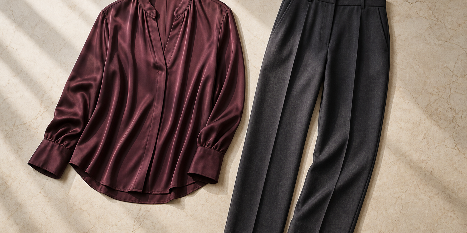
Key points
- Start with colour: use a simple structure, warm/cool families, and neutrals as connectors.
- Check proportion next, because the same colours can look different in different amounts.
- Prints are easier to read when paired with solids, especially neutral ones.
- Context matters: lifestyle, work environment, daily activities, and cultural expectations should influence the choice.
- Any exact outfit formula not stated in the sources should be treated as an editorial example, not a universal rule.
Direct answer: five questions for two separates
If you want to decide whether two separates work together, use this order: colour relationship, proportion, repetition, focal detail, and context. The approved sources support a simple colour structure, warm and cool colour families, neutral connectors, the importance of proportion, and choosing clothing according to the situation it will be used in. Where this article gives a specific pairing or formula, it is labelled as an Editorial example rather than a universal rule.
A helpful way to think about the process is this: start with what the two garments are doing visually, then check how they share space, and finally ask whether the pairing fits the situation you are dressing for. That keeps the decision grounded and avoids treating any one combination as automatically correct.
How to Check Whether Two Separates Belong in the Same Outfit
How to Style an Outfit Around One Statement Piece Without Making It Feel Busy
Question 1: what is the colour relationship?
The first check is whether the two separates sit comfortably within a simple colour structure. The approved source supports a beginner-friendly approach that keeps the main clothing items within a small number of colours, with one additional colour allowed for accessories.
A second part of the colour check is family relationship. Colours can be considered in warm and cool groups, and neutrals such as black, white, and gray can work as connectors because they combine with other colours flexibly.
A practical reading of this step is simple:
- If both garments are neutral, the colour question is usually straightforward.
- If one garment is coloured and the other is neutral, the neutral often acts as the link.
- If both garments are coloured, ask whether they belong to the same warm or cool family, or whether one of them is doing the connecting work through neutrality.
This is not a universal rule for every outfit. It is a colour-coordination check supported by the sources.
Question 2: how much visual space does each garment occupy?
Proportion matters because the same colours can look different depending on how much visual space each one takes up. The source on modern colour combinations states directly that colour proportion is crucial and that the same colours in different proportions can produce very different results.
That means you should not assess a pairing only by naming the colours. Also look at how the colours are distributed across the two pieces.
A simple comparison can help:
| What to compare | What you are checking | |---|---| | Large colour area | Which garment occupies more visual space | | Small colour area | Which garment appears as an accent or support | | Balanced area | Whether the two garments feel visually even | | Uneven area | Whether the difference feels intentional rather than accidental |
The point is not to rank one piece as better than the other. It is to notice how the colours behave when they are seen in different amounts.
Question 3: is there useful visual repetition?
The approved sources do not give a standalone rule for repetition, so this section is an editorial interpretation built from the colour guidance. In practice, repetition can mean a repeated colour, a repeated neutral structure, or a repeated print-and-solid rhythm that helps the eye move through the outfit.
Editorial example: a neutral top with a coloured bottom can feel connected if the neutral is doing the linking work and the colour stays within a simple structure.
Editorial example: two bold colours can feel more intentional when they share a warm or cool family, even if they are not identical.
When you are comparing two separates, repetition is useful only if it clarifies the pairing. If the repetition is too faint to notice, the outfit may still work, but the connection will come more from colour structure and proportion than from repetition itself.
Question 4: which garment carries the focal detail?
The sources do not define a formal focal-point hierarchy, so this section stays interpretive. A practical way to use the available evidence is to notice whether one garment has more visual activity than the other. Prints and solids are especially helpful here: the source notes that prints pair predictably with solid colours, and that neutral colours work especially well with prints.
That gives you a usable decision path:
- If one garment is printed, ask whether the other piece is calm enough to support it.
- If one garment is neutral, ask whether it can act as a connector.
- If both garments are visually active, check whether the colour relationship and proportion already give the pairing enough structure.
Editorial example: a printed separate and a solid separate can work together when the solid gives the print room to read clearly.
Editorial example: an animal print paired with a neutral colour follows the source-backed principle that prints and neutrals can combine well.
This is a composition check, not a statement that one garment must dominate the other.
Question 5: does the pairing suit the supplied context?
The final check is context. The approved sources say styling should take into account lifestyle, work environment, daily activities, and cultural expectations. They also frame wardrobe consultation as guidance about appropriate clothing for various occasions, which means the outfit decision should be read alongside the situation it is for.
This matters because the same two separates can make sense in one context and feel less fitting in another. The sources do not provide a universal occasion formula. This guide therefore keeps each comparison tied to the context supplied for that editorial example rather than inventing a scenario.
A concise context check looks like this:
- Does the pairing fit the stated lifestyle or activity?
- Does it respect the work environment if one is supplied?
- Does it fit the cultural expectations if that context is relevant?
- Does anything in the setting change the colour or print choice?
If the answer is unclear, return to the earlier questions. A pairing that looks fine in colour may still need adjustment once context is considered.
Three labelled editorial examples
The following examples are not universal formulas. They are Editorial examples that show how the five questions can be applied.
Editorial example 1: neutral plus colour
A neutral top with a coloured bottom can be tested by asking whether the neutral is acting as the connector. If the colour stays within a simple structure and the proportion feels deliberate, the pairing may read as coherent.
Editorial example 2: print plus solid
A printed separate with a solid companion uses the source-backed print-and-solid principle. If the solid is neutral, the pairing may feel especially straightforward because neutrals can combine with other colours flexibly.
Editorial example 3: two bold colours
Two bold colours can be compared first by proportion, then by warm or cool family. If the colours sit within a simple structure and one piece occupies more visual space in a deliberate way, the pairing may feel more organized.
A repeatable decision checklist
Use this short sequence whenever you compare two separates.
- Colour: Are the two pieces within a simple colour structure?
- Family: Do they belong to the same warm or cool group, or is a neutral connecting them?
- Proportion: Does the amount of each colour feel intentional?
- Repetition: Is there any repeated colour, neutral structure, or print-and-solid rhythm that helps the eye read the pairing?
- Focal detail: Is one piece visually busier, and is the other piece calm enough to support it?
- Context: Does the pairing suit the situation provided, including lifestyle, work environment, daily activities, and cultural expectations?
If most of the answers are clear, the pairing is likely easier to understand visually. If several answers are unclear, the pairing may still work, but it benefits from a second look.
Concise summary
To decide whether two separates work together, check the colour relationship first, then compare proportion, repetition, focal detail, and context. The strongest source-backed principles here are simple colour limits, warm and cool colour families, neutral connectors, the importance of proportion, print-with-solid pairings, and attention to situation. Any exact pairing beyond those principles should be treated as an editorial example, not a universal rule.
Frequently asked questions
Can neutrals work with any colour?
The approved source says black, white, and gray are neutral colours that can be combined with any other colour. That makes neutrals especially useful when you want a simple connector between two separates.
Do two garments have to match exactly to work together?
No source-backed rule says they must match exactly. The available guidance points instead to colour structure, warm and cool families, proportion, and context.
Are prints easier to combine with solids?
Yes, the source-backed guidance says prints work more predictably with solid colours, and it also notes that neutrals pair especially well with prints.
Should context really matter if the colours look good?
Yes. The sources specifically say to consider lifestyle, work environment, daily activities, and cultural expectations. Colour alone is not the whole decision.
Is there one correct way to pair two separates?
No. The sources support flexible colour coordination rather than fixed outfit laws. If a pairing is not directly stated in the sources, it should be treated as an editorial example rather than a universal formula.
Questions readers often ask
Can neutrals work with any colour?
The approved source says black, white, and gray are neutral colours that can be combined with any other colour, making them flexible connectors.
Do two garments have to match exactly to work together?
No source-backed rule says they must match exactly. The guidance focuses on colour structure, warm and cool families, proportion, and context.
Are prints easier to combine with solids?
Yes. The source says prints work more predictably with solid colours, and it notes that neutrals pair especially well with prints.
Should context really matter if the colours look good?
Yes. The approved sources say to consider lifestyle, work environment, daily activities, and cultural expectations when choosing colours and styles.
Is there one correct way to pair two separates?
No. The sources support flexible colour coordination rather than fixed outfit laws. If a specific pairing is not directly stated, it should be treated as an editorial example.
Want a simpler outfit check?
Use the five-question framework in this guide as a calm, repeatable way to assess colour, proportion, and context before deciding on a pairing.
Read the related guide