
How to Check Whether Two Separates Belong in the Same Outfit
A calm, body-neutral way to compare two separates through colour, proportion, repetition, and context—without turning outfit pairing into a strict yes-or-no rule.
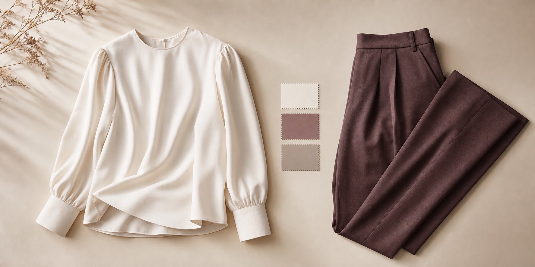
Key points
- Treat two-separate outfit matching as a compositional comparison, not a universal rule.
- Colour relationship, proportion, repetition, and context are the main cues supported by the sources.
- Neutral colours can act as flexible connectors between more vivid or patterned pieces.
- Repetition can be subtle: a shared tone, motif, or colour note may be enough.
- Personal taste and experimentation still matter, and the sources do not support a single fixed standard.
When you compare two separates for one outfit, it helps to think in terms of composition rather than approval. The question is not whether there is one correct answer. It is whether the pieces relate to each other in a way that feels deliberate.
The source material supports a flexible way of reading that relationship. Colour can connect the pieces. Proportion can shift the result. Repetition can make a pairing feel linked even when the items are not identical. And personal taste still matters.
Define what belonging in the same outfit means
A useful starting point is to treat the pairing as a visual comparison. Do the two separates relate in colour? Do they balance one another in proportion? Is there any repeated colour, tone, or motif? What is the surrounding context of the outfit idea?
That approach matters because the sources do not present clothing combinations as fixed forever. They describe colour relationships as something that can evolve, and they also emphasise experimentation and personal opinion. In other words, the goal is not to search for a universal yes or no.
Instead, the more useful question is: do these two pieces work together as a composition?
A context-first comparison can use visual repetition as one descriptive cue: a repeated colour, line or proportion may connect two separates without proving that the pairing is universally correct.
Start with the colour relationship
Colour is often the fastest way to judge whether two separates sit well together.
The source material describes colour pairings in several ways: some combinations are framed as complementary, some as classic, some as neutral-friendly, and some as energetic. That gives you a practical lens for comparing garments without treating any one pairing as permanent law.
A neutral can be especially helpful here. Black, white, and gray are described as versatile, flexible, and classic, which makes them useful as connectors when you are comparing two garments. A neutral piece can act like a bridge between a stronger colour and the rest of the outfit.
That does not mean a neutral is required. It simply means neutrals are often easy to place inside a composition because they are described as combinable with other colours and useful as a foundation for outfit building.
A simple way to read the colour relationship is to ask:
- Are the colours related or contrasting?
- Does one piece act as a neutral bridge?
- Do the colours feel calm, bold, classic, or energetic together?
- Does the pairing still make sense if you look at it as a colour relationship rather than a rule?
If the answer is “yes, but not in an exact-match way,” that can still be a valid result. The sources explicitly support flexibility.
Compare how much visual space each separate occupies
Proportion matters because the same colours used in different proportions can produce different results. That means two separates should not be judged only by whether they share a colour family. You also need to notice how much visual space each item takes up in the outfit.
This is a compositional check, not a body check.
Ask yourself:
- Which piece occupies more visual space?
- Is one garment dominant and the other quieter?
- Does the balance feel intentional?
- Would the pairing feel different if the larger piece were the smaller one, or vice versa?
A useful way to think about it is that proportion changes emphasis. A large patterned piece can lead the outfit, while a smaller solid piece can support it. Two equally strong pieces may feel more active or more contrast-driven. Neither option is automatically better; they simply create different visual outcomes.
Because proportion changes the result, it is sensible to judge the pairing as a whole rather than asking whether one item is “right” by itself.
Look for repetition without requiring an exact match
Two separates do not need to repeat each other exactly to feel connected.
The source material supports looking for repetition in colour, tone, or motif. It also notes that prints create many combination possibilities, and that animal print can be paired with solid colours. That makes repetition-versus-contrast a useful comparison tool.
Repetition can appear in several forms:
- a shared colour note
- a similar tone or depth
- a repeated motif inside a print
- a colour from the print echoed in the other garment
This is where the pairing can become more intentional. A solid piece may quietly repeat one shade from a print. Two coloured items may share a similar softness or intensity even if they are not identical. A patterned item may stand in stronger contrast to a plain one while still feeling connected through a repeated colour note.
The important part is that repetition is a support, not a requirement. The sources encourage experimentation, so a pairing can still be interesting if the repetition is partial rather than exact.
Check whether one item is the focal point
Another way to judge two separates is to ask which item carries the visual emphasis.
The sources do not give a formal definition of “focal point” for garment-to-garment comparison, so this should be understood as a visual-composition interpretation. In practice, it means noticing which piece attracts attention first because of colour, print, or proportion.
That can be helpful when you are deciding whether the outfit feels intentional.
Consider these questions:
- Is one piece visually louder than the other?
- Does the quieter piece support the stronger one?
- Does the outfit feel balanced, or does one item seem disconnected?
- Does the emphasis make sense for the pairing you are trying to create?
Sometimes a strong focal piece works best when the second garment is calm and supportive. Sometimes two pieces share the spotlight more evenly. The sources do not support a universal standard here, so the useful test is whether the visual emphasis feels coherent.
Editorial examples for two-separate comparisons
The examples below are editorial examples, not universal rules.
Editorial example: a solid navy top with white trousers
This pairing can be read through contrast, proportion, and neutral flexibility. The navy and white relationship is clear, the trousers may occupy more visual space than the top, and the overall effect depends on how those proportions sit together.
Editorial example: a patterned skirt with a plain black top
This pairing can be checked by asking whether the black repeats a colour inside the print. If it does, the outfit may feel more connected. If it does not, the pairing may still work through contrast and proportion.
Editorial example: a bright coral blouse with a muted pink skirt
This pairing can be compared as related colour values rather than an exact match. The question is not whether the shades are identical. The question is whether they feel comfortably related in the same outfit.
Editorial example: a print with a small repeated colour note and a neutral separate
If one piece contains a colour that appears again in the second piece, that repetition can create a link. If the second piece is neutral, it may act as a bridge rather than a competitor.
Editorial example: two bold colours placed side by side
If both pieces are vivid, the key question is whether they feel related, complementary, or too similar in value when viewed together. The answer may depend as much on proportion as on hue.
These examples show the method, but they are not formulas. The sources support experimentation, and the final result depends on the specific relationship between the pieces.
A neutral comparison checklist
Use this checklist as a calm way to compare two separates:
- Identify the colour relationship. Are the pieces related, contrasting, neutral-linked, or print-plus-solid?
- Check the proportion. How much visual space does each piece occupy?
- Look for repetition. Is there a shared colour, tone, or motif?
- Notice the focal point. Which piece leads visually?
- Step back and judge the composition as a whole.
- Allow for taste. If the pairing feels interesting and intentional, that matters.
This is not a fixed outfit formula. It is a way to compare garments without forcing them into a yes/no box.
What context can change
The source material supports paying attention to surrounding context, but it does not provide a rigid context rule. So it is best to keep this broad and neutral.
Context can include the way the pieces sit together in the full outfit, the role each item plays in the composition, and whether the overall arrangement feels coherent. A pairing that feels too busy in one arrangement may feel balanced in another, simply because the proportions or surrounding elements change.
That is another reason the comparison should stay flexible. You are not judging a garment in isolation. You are judging a relationship.
Why there is no universal yes-or-no answer
A useful style question usually has more than one acceptable answer. The sources explicitly encourage experimentation and note that personal taste and opinion still matter. They also describe colour combinations as changing over time.
So if two separates do not create a perfect match, that does not automatically make them wrong. It may simply mean the pairing is more contrast-driven, more experimental, or more dependent on proportion.
That is often the most practical way to think about it:
- some pairings are calm and classic
- some are energetic or more contrast-led
- some work because a neutral connects them
- some work because a print repeats a colour or motif
- some work because the proportions feel deliberate
The method is compositional, not absolute.
Quick summary
If you want a simple way to check whether two separates belong in the same outfit, look at four things: colour relationship, proportion, repetition, and context.
The sources support neutrals as flexible connectors, proportion as a meaningful part of the result, and print or colour repetition as a way to create links. They also support experimentation, which means the best answer is often the one that makes the whole composition feel intentional.
Related reading
- How to Combine Colors in an Outfit Without It Feeling Busy
- How to Style an Outfit Around One Statement Piece Without Making It Feel Busy
FAQ
Do two separates need to match exactly?
No. The sources support comparing the pieces by colour relationship, proportion, and repetition, not by demanding an exact match. A shared tone, a related colour family, or a repeated motif can be enough to create a coherent pairing.
Do neutral colours always make two pieces work together?
Not always, but they are described as flexible connectors. Black, white, and gray can work as a useful foundation when you are comparing two separates, especially if one item is more vivid or patterned.
Is experimentation allowed if the pairing is not traditional?
Yes. The sources explicitly support experimentation and note that personal taste and opinion still matter. That means an interesting pairing does not have to fit a fixed formula to be a valid choice.
What if one piece is patterned and the other is solid?
Check whether the solid piece repeats a colour, tone, or motif from the print. If it does, the pairing may feel more connected. If it does not, the arrangement may still work through contrast and proportion.
Questions readers often ask
Do two separates need to match exactly?
No. The sources support comparing the pieces by colour relationship, proportion, and repetition, not by demanding an exact match. A shared tone, a related colour family, or a repeated motif can be enough to create a coherent pairing.
Do neutral colours always make two pieces work together?
Not always, but they are described as flexible connectors. Black, white, and gray can work as a useful foundation when you are comparing two separates, especially if one item is more vivid or patterned.
Is experimentation allowed if the pairing is not traditional?
Yes. The sources explicitly support experimentation and note that personal taste and opinion still matter. That means an interesting pairing does not have to fit a fixed formula to be a valid choice.
What if one piece is patterned and the other is solid?
Check whether the solid piece repeats a colour, tone, or motif from the print. If it does, the pairing may feel more connected. If it does not, the arrangement may still work through contrast and proportion.
Explore Smart Wardrobe
Use Smart Wardrobe to compare two separates that you explicitly add.
Explore Smart Wardrobe