How to Combine Colors in an Outfit Without It Feeling Busy
A calm, cohesive outfit is often less about strict rules and more about proportion, repetition, and restraint. Here’s an editorial guide to combining colors in a way that feels intentional.
Key points
- Neutral colours make a flexible base for easier coordination.
- Keeping a look mostly warm or mostly cool can reduce clashing.
- Proportion matters: the same colours can feel calmer or busier depending on how much of each is used.
- Repeating one colour in a small detail helps an outfit feel intentional.
- Prints work best when their share is controlled and balanced with solids.
- Simple lines and understated pieces reduce visual clutter.
- Treat these as editorial starting points, not universal rules.
When people ask how to combine colors in an outfit, the real challenge is often not the colors themselves. It is the way they compete for attention.
An outfit can feel busy when too many elements are asking to be noticed at once: strong contrast, multiple active colours, large prints, or details that do not repeat anywhere else. The good news is that a calmer result usually comes from a few practical choices rather than a complicated formula.
This is an editorial guide, not a universal rulebook. Think of it as a way to create more visual ease and clearer colour hierarchy.
Why colour combinations can feel visually busy
The same palette can feel settled or energetic depending on proportion. In other words, the amount of each colour matters as much as the colours themselves. A small amount of a stronger shade can feel much quieter than giving that shade equal weight.
Prints can also add movement. That is not a problem by itself, but prints tend to feel less busy when their share of the outfit stays relatively small and the rest of the look is kept simple. Simple lines, clean shapes, and solid colours reduce competing details and make the overall result easier to read.
So if an outfit feels crowded, the issue is often not “too many colours” in the abstract. More often, the balance between them needs adjusting.
Choose a visual anchor
A useful starting point is to give the outfit one clear anchor. That anchor might be a neutral base, one dominant colour, or one simple, understated item.
Neutrals such as black, white, grey, navy, and beige are flexible because they are easy to mix with other colours. They can function as a foundation and make the rest of the outfit easier to coordinate. Structured wardrobe staples in neutral shades are especially helpful when you want a stable base for adding a controlled accent.
A practical way to keep the look calm is to limit the main clothing colours and let accessories carry the small extra colour. That keeps the eye from bouncing between too many large areas at once.
If you like a more polished, steady look, How to Build an Elegant Wardrobe with a Structured System pairs well with this approach.
Repeat one colour intentionally
One of the simplest ways to make an outfit feel deliberate is to repeat a colour on purpose.
For example, if a shoe, scarf, or patterned detail contains one shade you like, echo that shade somewhere else in the outfit. It does not need to be an exact match or appear in a large amount. Even a small repetition can make the whole look feel more cohesive.
This works because the eye recognises the colour as part of a planned pattern rather than a random addition. Repetition creates a quiet sense of order.
Proportion still matters here. If the repeated colour appears in one large item and one tiny detail, the result may feel calmer than if the same colour appears at several competing points in equal strength.
Keep intensity relationships calm
If you want the outfit to feel more settled, it can help to choose either warm colours or cool colours within one look. For beginners, sticking mostly to one temperature family reduces the chance of clashing.
That does not mean every item must be identical in tone. Neutrals can soften the transition and help the outfit breathe. The key idea is to keep the overall relationship clear rather than mixing many strong directions at once.
This is where proportion becomes especially useful. The same colours can look more relaxed or more energetic depending on how much of each is used. A dominant colour, a supporting colour, and a restrained accent usually feel calmer than three equal voices.
Combine print and solid colour
Prints can add interest without making an outfit feel chaotic, especially when they are balanced by solids.
A good editorial starting point is to keep the print percentage relatively small and surround it with simpler pieces. If a printed item introduces several colours, choose one of those colours to repeat elsewhere in the outfit. That one repeat acts like a bridge.
Simple, solid companions are especially helpful here. Clean lines and understated pieces reduce visual noise and allow the print to do its job without taking over the whole look.
A striking outfit does not need to be loud. A controlled print paired with solid colours can feel confident precisely because it is organised.
Practical outfit formulas
Here are a few flexible starting points you can adapt.
1. Neutral base + one colour accent
Start with neutral clothing such as black, white, grey, navy, or beige. Then add one colour in a controlled way, either in one main piece or in a small accessory detail.
This is a useful option when you want the palette to feel calm and easy to coordinate.
2. Two main colours + one small repeat
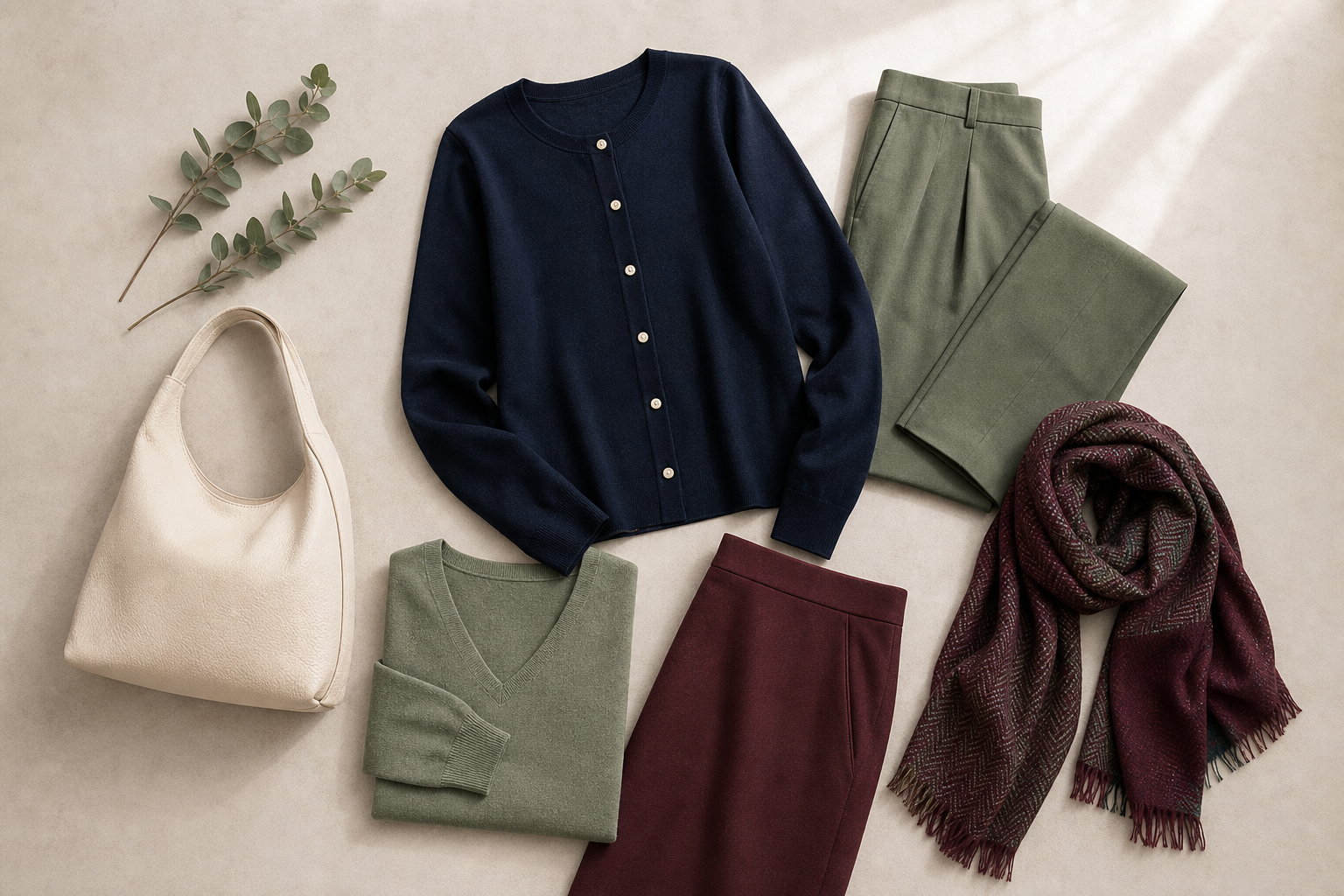
Use two main colours in the clothing and echo one of them in a smaller detail such as a bag, scarf, or shoe. The repetition makes the outfit feel intentional, while the smaller detail keeps the accent light.
3. One print + solid companions
Choose one printed item and keep the rest of the outfit solid. If possible, repeat one colour from the print somewhere else in the look. That small link keeps the print from feeling isolated.
4. Warm palette or cool palette
Build the outfit mostly from warm shades or mostly from cool shades, then use a neutral piece to soften the result. This is a simple way to reduce visual friction when you do not want strong contrast.
5. Structured staples + a controlled accent
A neutral blazer, tailored layer, or other structured staple can act as a stable base. From there, add one colour or print as a personal touch rather than spreading several active elements across the outfit.
If you like a more system-based approach to dressing, Color Analysis: Discover the Best Shades for Your Natural Glow may also be useful context, even if you are not using it as a personal colour analysis.
A simple way to think about colour hierarchy
If an outfit feels unsettled, ask three questions:
- What is the anchor?
- What colour is being repeated?
- Which element is the most active, and can it be reduced?
Those questions help you shift from “How many colours are here?” to “Which colour is leading, and which ones are supporting it?” That is usually the more useful way to think about how to combine colors in an outfit.
Colour harmony is less about strict counting and more about organising attention. When the palette has a clear anchor, a purposeful repeat, and a restrained print or accent, the outfit usually feels more cohesive.
FAQ
Can I use more than two colours in one outfit?
Yes, but proportion matters. The approved guidance supports a two-colour approach for the main clothing items, with an optional extra colour in accessories. That is best understood as a practical starting point, not a fixed law.
What makes an outfit feel less busy?
Outfits usually feel less busy when the most active element is limited, prints are kept relatively small, and the rest of the look uses solid or simple pieces. Repetition also helps because it makes the colour story feel intentional.
Do prints always make colour combinations harder?
Not necessarily. Prints work well when their share of the outfit stays controlled and the surrounding pieces are simpler. Repeating one colour from the print elsewhere can also make the result feel more cohesive.
Is there one best way to combine colors in an outfit?
No single formula fits every look. The sources support proportion, repetition, and restraint as helpful starting points, but the final result depends on the balance of colours, print scale, and contrast level.
Combining colours well is often less about following a rigid rule and more about creating a clear visual structure. If you start with neutrals, repeat one colour on purpose, and keep prints or accents restrained, the outfit usually feels calmer and more deliberate.
Questions readers often ask
Can I use more than two colours in one outfit?
Yes, but the approved guidance supports a two-colour approach for the main clothing items, with an optional extra colour in accessories. That is best understood as a practical starting point, not a fixed law.
What makes an outfit feel less busy?
Outfits usually feel less busy when the most active element is limited, prints are kept relatively small, and the rest of the look uses solid or simple pieces. Repetition also helps because it makes the colour story feel intentional.
Do prints always make colour combinations harder?
Not necessarily. Prints work well when their share of the outfit stays controlled and the surrounding pieces are simpler. Repeating one colour from the print elsewhere can also make the result feel more cohesive.
Is there one best way to combine colors in an outfit?
No single formula fits every look. The sources support proportion, repetition, and restraint as helpful starting points, but the final result depends on the balance of colours, print scale, and contrast level.
Try a calmer color combination next time you style an outfit
If you want to test a few combinations, start with a neutral base, repeat one accent colour, and keep prints or accessories restrained. Explore Smart Wardrobe when you are ready to compare combinations in a more deliberate way.
Explore Smart Wardrobe