
7 mistakes when balancing a detailed garment with simpler accessories
If you are comparing a detailed garment with simpler accessories, the safest approach is to separate what you can see from what you are assuming. This guide shows common coordination mistakes, explains why colour proportion, context, and personal preference matter, and gives a neutral checklist for reviewing a look without turning examples into rules.
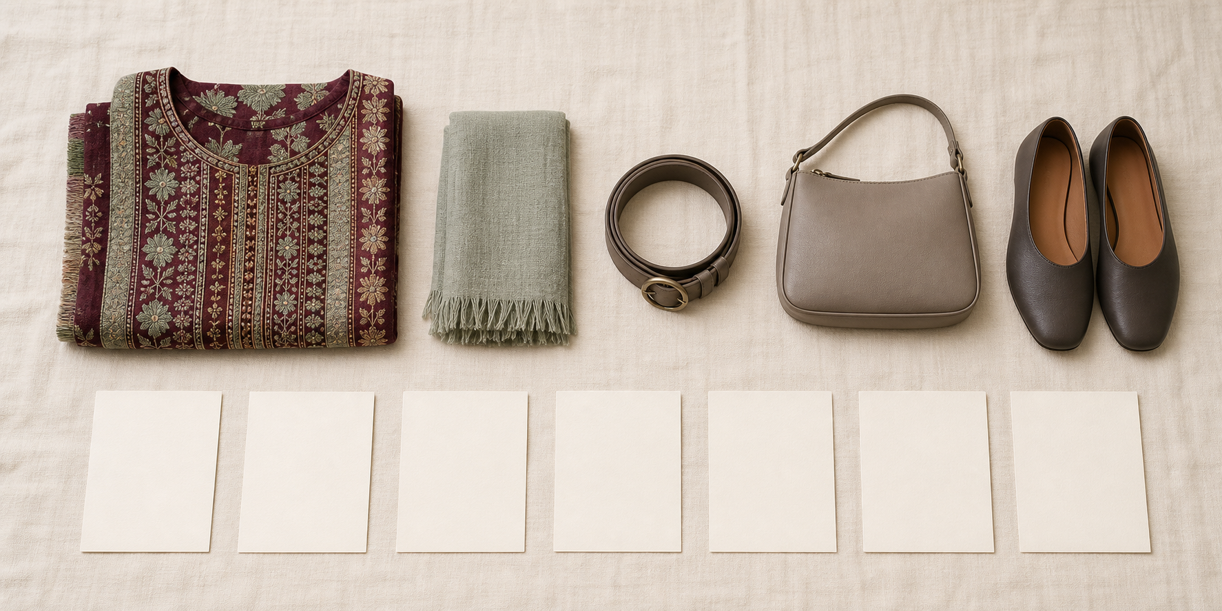
Key points
- Treat exact outfit combinations as examples unless the source clearly states a general rule.
- Review colour, line, texture, and scale separately instead of collapsing them into one judgment.
- Neutral colours can be flexible, but they are not a universal visual solution.
- Context and personal preference can change the right answer.
- Do not infer body, ownership, or preferences from a look alone.
What this guide can and cannot decide
When people ask how to balance a detailed garment with simpler accessories, the real risk is turning a visible observation into an unsupported rule. A styling example can show one possible result, but it cannot tell you whether a specific garment is “too busy,” whether a neutral accessory is automatically the right answer, or what someone’s body, workplace, or preferences are.
This guide is for readers who want a practical, body-neutral way to review a look without making assumptions. The core idea is simple: separate what is observable from what is inferred, and treat exact outfit configurations as examples unless the source explicitly presents them as general principles.
Mistake 1: Treating simpler accessories as a universal rule
A simple accessory can be one valid option, but it is not a universal solution. Neutral colours are often flexible and easy to combine, yet that does not make them the correct answer in every case. Personal preference and comfort also matter, so simplicity is not something you can always impose as the “right” outcome.
A better approach is to ask what the accessory is doing in the overall look. Does it change contrast, proportion, or the visual balance of the outfit? If you cannot answer that from the visible information, do not present simplicity as a rule.
Mistake 2: Describing a garment as “busy” without visible evidence
“Busy” is a judgment, not a fact. The sources support the idea that appearance communicates something, but they do not support ranking one accessory style as always better or turning a vague impression into a universal conclusion.
If you want to describe a garment accurately, name the visible elements first. For example: colour, line, texture, proportion, and scale. Only then can you explain why a combination feels visually active, detailed, or restrained. If the evidence is not visible, avoid the label.
Mistake 3: Collapsing colour, line, texture, and scale into one judgment
Colour coordination is affected by proportion, and the same colours in different proportions can produce different results. That means colour should not be treated as interchangeable with line, texture, or scale.
A useful way to review a look is to separate the visual features:
- Colour: what hues are present, and in what proportions?
- Line: are the shapes sharp, soft, long, compact, straight, or curved?
- Texture: does the surface read smooth, matte, reflective, or tactile?
- Scale: are the elements small, medium, or visually large relative to one another?
A judgment becomes clearer when each feature is considered on its own. It becomes less reliable when everything is compressed into a single “works” or “doesn’t work” conclusion.
Mistake 4: Assuming a neutral accessory has no visual weight
Neutral colours are flexible, but neutral does not mean invisible. A neutral accessory can still have presence through size, texture, contrast, or proportion. The source support for colour coordination points to proportion as a major factor, so two accessories can behave differently even if both are neutral.
Editorial example: A neutral accessory with more visual weight can still change the balance of a look more than a smaller or quieter one, even when the colour itself is understated.
That is why it helps to describe what the accessory actually does, rather than assuming that “neutral” automatically means “best” or “least noticeable.”
Mistake 5: Inferring the wearer’s body, ownership, or preference
The brief does not support inferring who owns the garment, what body shape someone has, or what they prefer. Image consulting can involve considering body shape and appearance, but that is a styling consideration, not a license to make a universal judgment about a person.
Personal preference is part of coordination too. The sources explicitly support comfort, appeal, and self-expression, even when that challenges conventional rules. So if a look seems simple or detailed, that alone does not tell you what the wearer wants, values, or needs.
Mistake 6: Ignoring supplied context
Context matters. The sources say colour coordination should consider lifestyle, cultural context, work environment, daily activities, and personal life. That means the same visual choice can be read differently depending on the context that is actually supplied.
If a situation includes context, use it. If it does not, do not invent it. This is especially important when a judgment depends on assumptions about where the look will be worn or what message it is meant to send.
Mistake 7: Presenting an editorial example as the preferred answer
An exact outfit configuration should be treated as an example unless the source explicitly presents it as a general rule. One source may offer beginner-friendly colour guidance, while another encourages experimentation and acknowledges changing trends. Together, that supports a simple editorial habit: describe examples as examples.
Editorial example: A detailed garment paired with a plain accessory can look balanced in one configuration, but that result depends on colour proportion, contrast, and overall scale rather than simplicity alone.
When you write or think about a look, ask whether you are seeing a general principle or only one illustrative arrangement. That distinction can reduce the risk of overclaiming.
How to correct a mistake without choosing for the reader
A useful correction starts by returning to observable details. Name the detailed garment, the simpler accessories being compared, and the specific feature under review. Then separate visual weight into colour, line, texture, scale, and proportion instead of treating the whole outfit as one verdict. This context-first framework keeps common mistakes visible without claiming that one option is correct for every person.
Next, record only the supplied context. If the prompt states an occasion, preference, weather condition, or practical need, that information can be considered. If it is not supplied, leave it unknown. The same boundary applies to ownership and body information: a visible garment does not establish who owns it, how it fits a particular person, or which choice that person would prefer.
Editorial example: A detailed woven garment and four equally presented simple accessories can be reviewed by comparing each accessory's colour contrast, surface texture, line, and scale. The example does not identify a winner. A reader may prefer stronger contrast, a quieter surface, a different scale, or another option entirely depending on the context they actually provide.
Finally, check the language of the conclusion. Replace universal wording such as “the accessory should disappear” with a description of the visible relationship. Replace a personal assumption with an open question. Keep any exact configuration labeled as an editorial example. These changes preserve the educational purpose while leaving room for supplied context and personal preference.
A neutral correction checklist
Use this quick checklist before you call a combination “right,” “wrong,” or “too much”:
- List only what is visible.
- Colour
- Line
- Texture
- Scale
- Proportion
- Separate facts from assumptions.
- What can you actually see?
- What are you inferring about the person or context?
- Check whether context was supplied.
- Lifestyle
- Cultural context
- Work environment
- Daily activities
- Treat neutrality carefully.
- Neutral colours can be flexible.
- Neutral does not automatically mean visually minimal.
- Test whether you are turning an example into a rule.
- If the source did not say “always,” do not write “always.”
- Leave room for preference.
- Comfort and appeal are part of coordination.
- Simplicity is one option, not the only one.
Quick summary
If you are comparing a detailed garment with simpler accessories, the safest reading is the one that stays closest to what is visible. Colour proportion matters. Neutral colours are flexible but not universal. Context and personal preference can change the answer. And an editorial example should stay an example unless the source clearly turns it into a rule.
Related guides
- Detailed Garment, Simpler Accessories: A Practical Checklist
- How to Balance a Detailed Garment with Simpler Accessories
Frequently asked questions
Is a neutral accessory always the safest choice?
No. Neutral colours are described as flexible and combinable, but the sources do not support treating neutrality as a universal answer. Colour proportion, context, and personal preference can all affect the result.
Can I call a garment “busy” if it has many details?
Only if the visible evidence supports that description. “Busy” is not something to assume from detail alone. It is better to point to the visible features that make the look feel more active or more restrained.
Should I always choose the simpler accessory?
No. Simplicity can be one option, but the sources also emphasize comfort, appeal, and self-expression. The better question is whether the accessory changes the overall balance in a way that fits the supplied context.
Do body shape and appearance matter in styling?
The sources discuss body shape and appearance as styling considerations, but they do not support making assumptions about a specific reader’s body. In practice, that means you can discuss styling choices generally without making personal conclusions.
Why does proportion matter so much?
Because the same colours in different proportions can produce different results. That is one reason a look may change even when the palette seems similar.
Final note
If you want a precise judgement, make the evidence precise first. Name the visible features, keep the context that was actually supplied, and treat exact outfit combinations as examples rather than rules.
Questions readers often ask
Is a neutral accessory always the safest choice?
No. Neutral colours are described as flexible and combinable, but the sources do not support treating neutrality as a universal answer. Colour proportion, context, and personal preference can all affect the result.
Can I call a garment “busy” if it has many details?
Only if the visible evidence supports that description. “Busy” is not something to assume from detail alone. It is better to point to the visible features that make the look feel more active or more restrained.
Should I always choose the simpler accessory?
No. Simplicity can be one option, but the sources also emphasize comfort, appeal, and self-expression. The better question is whether the accessory changes the overall balance in a way that fits the supplied context.
Do body shape and appearance matter in styling?
The sources discuss body shape and appearance as styling considerations, but they do not support making assumptions about a specific reader’s body. That means you can discuss styling choices generally without making personal conclusions.
Why does proportion matter so much?
Because the same colours in different proportions can produce different results. That is one reason a look may change even when the palette seems similar.
Explore the related guide
If you want a more practical next step, you can review the companion guide for a structured way to compare detailed garments and simpler accessories.
Open the guide