
How to Adjust Colour Contrast for a Calmer or Sharper Outfit
Colour contrast is a visual relationship, not a ranking. Here’s how proportion, warm and cool groupings, neutrals, and bold or muted pairings shape the overall effect.
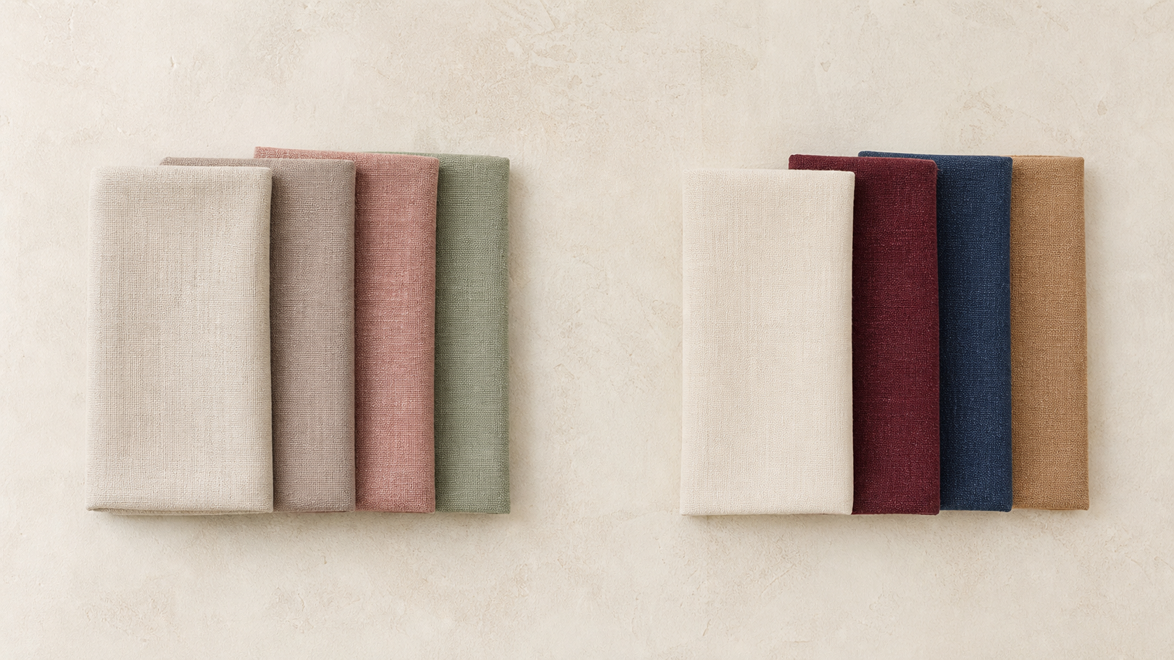
Key points
- Colour contrast is a visual relationship, not a ranking.
- The same colours can look different when their proportions change.
- A simple starting point is two main colours plus one accessory colour.
- Warm-only or cool-only outfits can be an easier way to avoid clashing.
- Black, white, and gray are flexible neutrals that combine with other colours.
- Bold pairings can create a stronger effect, while muted palettes can create a gentler one.
- Personal taste and experimentation still matter, and personal colour analysis is outside this guide.
What colour contrast means in an outfit
In this guide, relative contrast means comparing only user-supplied garments to describe whether the intended direction is a calmer outfit or a sharper outfit. Colour contrast is best thought of as a visual relationship between colours rather than a fixed rule about what is “better.” In the approved sources, the same colours can create a different overall result depending on how they are combined, especially when the proportions change.
That means an outfit can look more separated, more unified, softer, or more striking without any need to rank one version above another. The effect comes from how the colours sit next to each other.
The sources support two broad visual directions:
- more distinct or bold pairings can create a stronger visual effect
- softer or muted palettes can create a gentler visual effect
Those are descriptive impressions, not personal judgments.
Describe contrast without turning it into a rule
If you want to adjust colour contrast for a calmer or sharper outfit, it helps to keep the language visual. Instead of asking whether a combination is “right” for a person, ask what the colours do together.
The approved sources do not define a technical scale for low, medium, or high contrast. They also do not say when one level should be preferred over another. So the safest way to talk about contrast is relative:
- the same colours can appear different in different proportions
- colour pairings can feel stronger or softer depending on the combination
- personal taste and experimentation remain part of colour coordination
That framing keeps the topic practical without turning it into a universal rule.
Use proportion as one of the main controls
One supported way to change the result is to change the proportion of colours. The sources state that proportion is crucial and that the same colours in different proportions can yield completely different results.
This is useful because it means you can adjust the overall look without changing every colour in the outfit.
For example, a colour may read as the main focus if it covers more surface area, or as a supporting accent if it appears in a smaller amount. The approved sources support the idea that this shift in proportion affects the overall visual result.
Keep combinations simple when you want less visual complexity
A supported coordination principle is to use two colours maximum for the main clothing items, with one additional colour for accessories. In the sources, this is presented as a simplicity-oriented guideline.
That can be a helpful starting point if you want a clearer, more contained arrangement of colours.
A practical way to apply it is:
- choose up to two main clothing colours
- add one accessory colour if needed
- let one colour lead while the others support
This keeps the outfit readable without requiring many competing elements.
Stay within warm or cool colours for a more unified result
For beginners, the approved sources recommend staying within either warm colours or cool colours in one outfit to avoid clashing.
This is not presented as a universal rule for everyone. It is a practical starting point that can make coordination easier.
Warm colours are grouped together in the source as colours such as red, orange, and yellow. Cool colours are grouped together as colours such as blue, green, and purple. Staying within one family can create a more consistent visual relationship.
Use neutrals as flexible anchors
The approved sources describe black, white, and gray as neutral colours, or “anti-colors,” that can be combined with any other colour.
That makes them useful anchors when you want flexibility. A neutral can hold the outfit together while another colour provides the main visual character.
This does not mean a neutral is always the most interesting choice; it simply means it is easy to combine with other colours. In a practical outfit, neutral pieces can reduce the number of colour decisions you need to make.
Stronger effects and gentler effects are both valid
The approved sources also support the idea that complementary or bold pairings can create a stronger visual effect, while softer muted palettes create a gentler visual effect.
This is a useful distinction because it gives you two different kinds of colour relationships to work with.
A bolder pairing can come from stronger difference between colours. A gentler palette can come from muted tones or colours that sit more softly together. Neither is universally better. They simply produce different visible results.
Change one relationship at a time
If you are comparing outfits, it helps to change one variable at a time. The approved sources support proportion, warm or cool grouping, neutrals, and bold versus muted pairings, but they do not provide a formal method for measuring colour distance or saturation.
So rather than changing everything at once, you can test one element first:
- change the proportion of the colours
- keep the same warm or cool family but adjust the balance
- swap a bold pairing for a softer muted one
- introduce a neutral anchor and see how the outfit changes
This makes the visible effect easier to notice.
Keep personal colour analysis outside this guide
The approved sources support general colour-coordination principles, but personal colour analysis is outside the scope of this guide.
That means this article is about visible colour relationships, not about inferring complexion, body shape, wardrobe contents, or personal style preferences. It is also not a method for deciding what any individual “should” wear.
The most useful question here is simple: what happens when the colours are arranged differently?
Editorial examples of lower and higher contrast
The examples below are editorial examples only. They illustrate how different colour relationships can look softer or stronger, but they are not universal rules.
- Editorial example: black and white used with strong visual separation.
- Editorial example: navy and cream used with a softer visual separation.
- Editorial example: a warm-only pairing such as beige and brown for a more unified impression.
- Editorial example: a cool-only pairing such as blue and gray for a more unified impression.
- Editorial example: a neutral base with one added colour in accessories.
- Editorial example: a complementary pairing such as purple and coral for a stronger visual contrast.
- Editorial example: a muted palette such as pastel pink and soft blue for a gentler visual contrast.
These examples show the range of possible visual impressions supported by the sources. They are not prescriptive, and they do not describe what is best for a particular person.
A body-neutral checklist for colour contrast
If you want a simple way to review an outfit, use this checklist:
- How many colours are used in the main clothing items?
- Is there one additional colour only in the accessories, if needed?
- Are the colours all warm or all cool, or is the outfit mixing families?
- Is a neutral such as black, white, or gray acting as an anchor?
- Did the visual effect change when the proportion of the colours changed?
This checklist stays close to the approved sources and avoids making assumptions about the person wearing the outfit.
What this guide does not claim
To keep the topic clear and body-neutral, this guide does not claim that:
- lower contrast is universally better, calmer, more elegant, or more suitable
- higher contrast is universally better, sharper, more authoritative, or more suitable
- any combination will change confidence, mood, attractiveness, competence, or social outcomes
- contrast can be ranked with a universal technical scale from low to high for every situation
It also does not use flattering, slimming, elongating, correcting, or hiding language.
Colour contrast, in one sentence
Colour contrast is adjustable through proportion, grouping, neutrality, and the relationship between colours, while personal taste and experimentation remain important.
FAQ
Is lower colour contrast always calmer?
No. The approved sources do not support a universal rule that lower contrast is always calmer, more elegant, or better for a person. They support the idea that softer or muted palettes can create a gentler visual effect, but that is a description of the colour relationship, not a ranking.
Is higher colour contrast always sharper?
No. The sources support that complementary or bold pairings can create a stronger visual effect, but they do not say that this is always better or more suitable. It is one visual option among others.
What is the easiest way to begin?
A simple starting point is to keep the main outfit to two colours, add one accessory colour only if needed, and stay within either warm colours or cool colours. Neutrals such as black, white, and gray can also serve as flexible anchors.
Are exact colour pairings universal rules?
No. Exact combinations are editorial examples only. The approved sources support general coordination principles, but they do not turn any single pairing into a rule for everyone.
Does personal taste matter?
Yes. The approved sources explicitly support personal taste and experimentation as part of colour coordination. There is no single universal contrast rule.
Should I think about personal colour analysis here?
No. Personal colour analysis is outside this guide. This article is focused on visible colour relationships, not on body-based or complexion-based recommendations.
Questions readers often ask
Is lower colour contrast always calmer?
No. The approved sources do not support a universal rule that lower contrast is always calmer, more elegant, or better for a person. They support the idea that softer or muted palettes can create a gentler visual effect, but that is a description of the colour relationship, not a ranking.
Is higher colour contrast always sharper?
No. The sources support that complementary or bold pairings can create a stronger visual effect, but they do not say that this is always better or more suitable. It is one visual option among others.
What is the easiest way to begin?
A simple starting point is to keep the main outfit to two colours, add one accessory colour only if needed, and stay within either warm colours or cool colours. Neutrals such as black, white, and gray can also serve as flexible anchors.
Are exact colour pairings universal rules?
No. Exact combinations are editorial examples only. The approved sources support general coordination principles, but they do not turn any single pairing into a rule for everyone.
Does personal taste matter?
Yes. The approved sources explicitly support personal taste and experimentation as part of colour coordination. There is no single universal contrast rule.
Should I think about personal colour analysis here?
No. Personal colour analysis is outside this guide. This article is focused on visible colour relationships, not on body-based or complexion-based recommendations.
Want to compare colour combinations more systematically?
Explore the Color Analysis guide if you want a calm, practical way to compare only user-supplied colours and garments. It stays focused on visible colour relationships.
Open Color Analysis